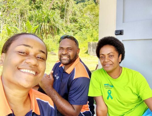
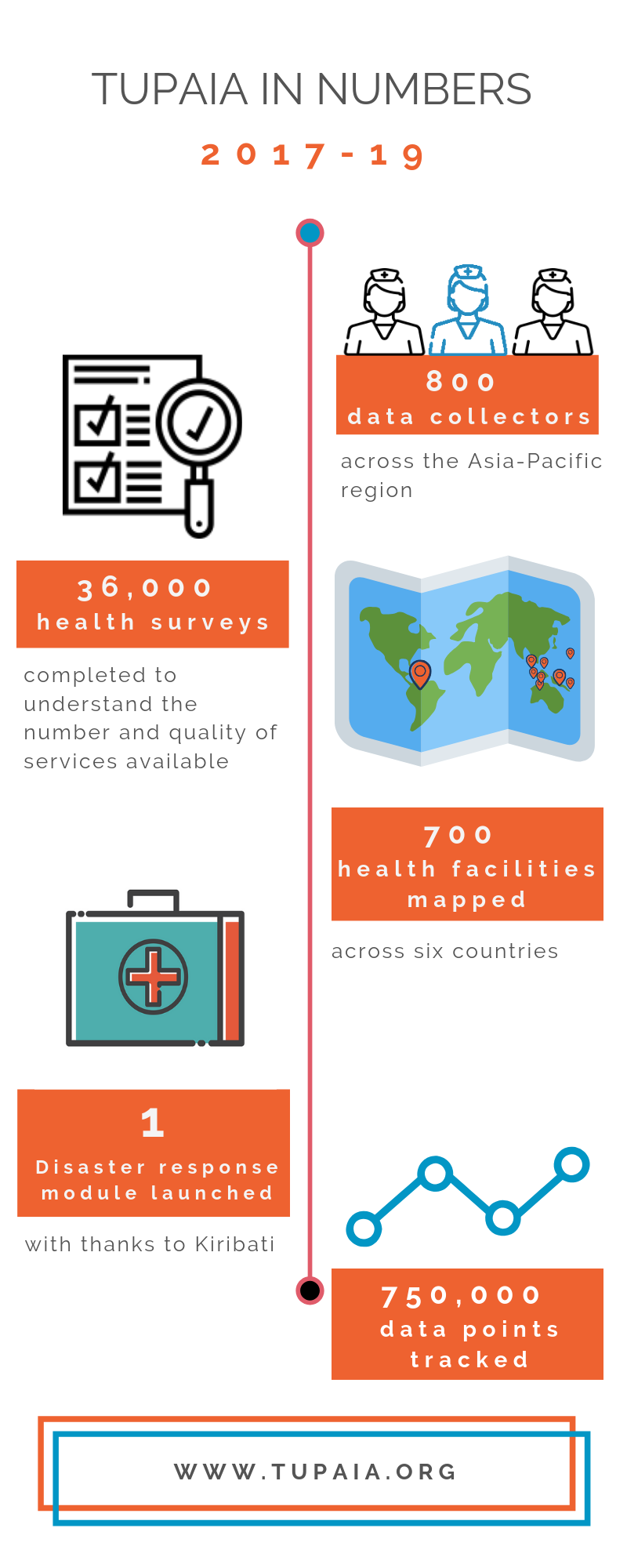
We’ve taken the middle of the year as an opportunity to take a step back, see what we’ve learned and reflect on what we’ve achieved since we launched in 2017.
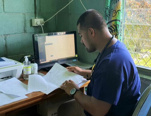
Without the help of our dedicated health workers who register and analyse health data and our talented team of software developers who bring to life this information with visual, mapping dashboards, Tupaia as we know it wouldn’t exist. Here are some facts and figures that reflect how our health resource mapping tools are using real-time data to help visualise health systems.
What’s next for Tupaia?
In the next 12 months, we’ll be starting exciting new partnerships in conjunction with the DFAT’s Indo-Pacific Centre for Health Security, including:
- Working with STRIVE PNG to help with malaria resistance mapping in PNG, and
- Working with WISH Fiji to undertake predictive environmental health mapping in Fiji.
If you haven’t seen Tupaia in action yet, you can see how we’re crowd sourcing clinic data from health clinic around the world by exploring Tupaia’s health mapping resource online.
[dt_default_button link=”https://tupaia.org/” button_alignment=”default” animation=”fadeIn” size=”medium” default_btn_bg_color=”” bg_hover_color=”” text_color=”” text_hover_color=”” icon=”fa fa-chevron-circle-right” icon_align=”left”]Start exploring![/dt_default_button]